2.1 - Viewing Dashboards
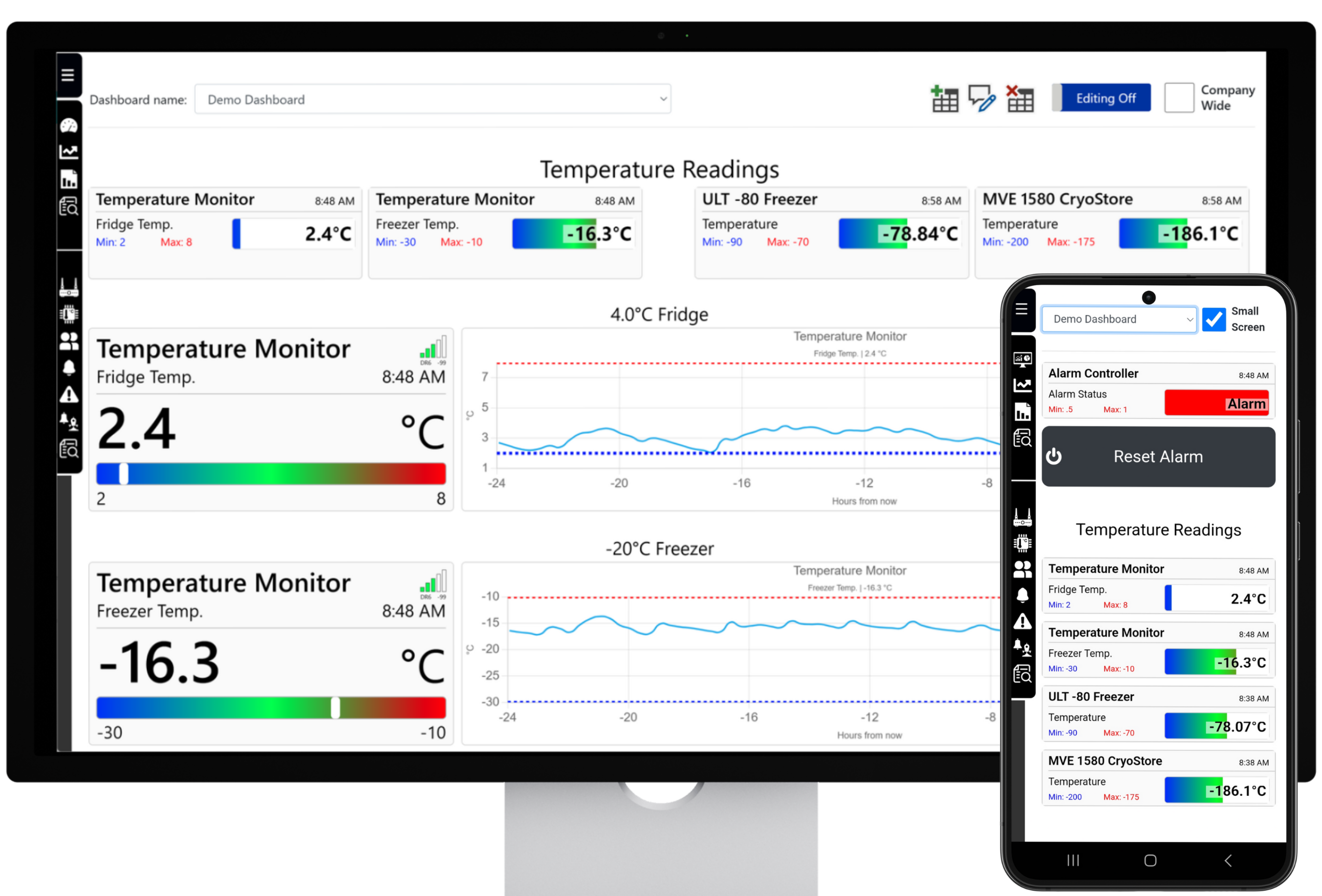
Dashboards provide a responsive, at-a-glance view of recent sensor readings, alert states, signal information, and compatible device controls.
All signed-in users can open the Dashboard page from the dashboard icon or the expanded platform menu. The dashboards available to each user depend on dashboards created for their account, copied to them, or shared company-wide.
Users assigned the Edit Dashboard role can create, rename, edit, share, and delete their own dashboards. User roles are configured in Section 6.2.3 - Configuring User Access .
On a mobile device, select the Small Screen checkbox in the top-right corner to arrange dashboard widgets in a single column. Selecting a sensor widget in view mode opens that sensor on the Charts page with its recent data.
Widget Border States
Node Has Lost Contact with the Server
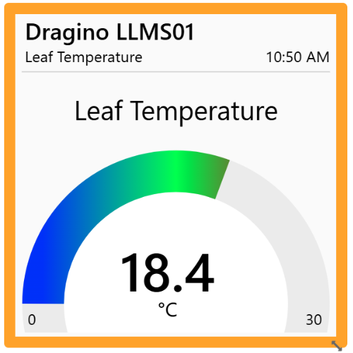
An orange widget border means the node has not connected to the service for more than three hours. Confirm that the node is powered, reboot it when appropriate, and then review its device and network configuration if contact is not restored.
Sensor Input Is Currently in Alert
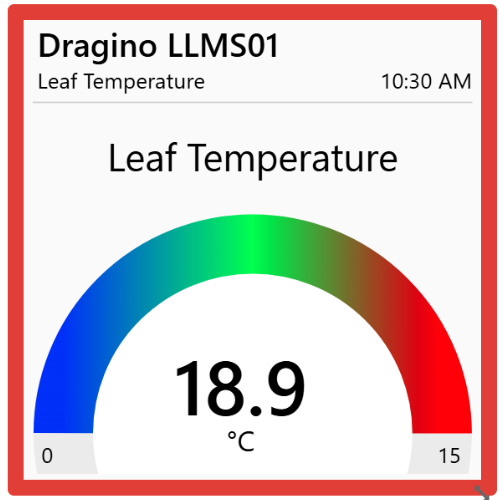
A red widget border means the sensor input is in an alert state and may have triggered configured notifications or actions. A reading outside the widget's visual scale does not by itself mean that an alert has been triggered.
Common Dashboard Features
The 1x1, 2x1, and 4x1 sensor widgets share the following signal, alert, and scale behaviour.
Signal Strength
RSSI indicates received signal strength; a value closer to zero represents a stronger received signal. DR is the LoRaWAN data rate used for the transmission.
Configured Alert Status
The LED in the top-right corner is white when no alerts are configured, orange when at least one alert is configured but inactive, and green when at least one configured alert is active.
Widget Scale
When scale limits are blank, the widget first uses the lowest Less Than and highest Greater Than alert conditions. If no alert conditions exist, it uses the lowest Lower limit and highest Upper limit from audit reports. Manually entered scale values override these automatic limits.
2.2 - Building Dashboards
The dashboard editing menu is shown only to users assigned the Edit Dashboard role and only while using a PC or laptop.
Users without this role can still view dashboards shared with or copied to their account by selecting a dashboard from the Dashboard Name list. Users with editing permission can create dashboards, change their names, enable the editing canvas, and make a dashboard available to all users under the account.

Dashboard Management Controls

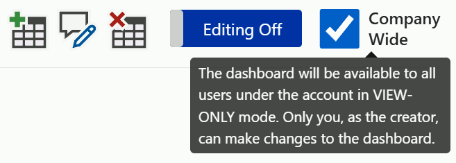
Add Dashboard
Enter a dashboard name in the pop-up window. The new dashboard is private to your account unless you select Company Wide.

Rename Dashboard
Enter the replacement dashboard name in the pop-up window and select Save.

Delete Dashboard
Delete the selected dashboard. It will also stop being available to users with whom it was shared.
Dashboard Editing
Enable the widget menu and editing canvas. You can then add, position, resize, remove, and configure widgets.
Company Wide
Allow every user under the account to view the dashboard. Only the creator can edit or delete the shared dashboard.
2.3 - Dashboard Widgets
Enable Dashboard Editing to display the widget menu, add widgets to the canvas, and configure each widget's data source and appearance.
Select a widget in the menu to add it to the canvas. Drag it to the required position,
then use the resize arrow
 in its bottom-right corner to change its size. Hold Shift while
resizing to preserve its aspect ratio. The canvas width follows the screen width and
can extend vertically as more widgets are added.
in its bottom-right corner to change its size. Hold Shift while
resizing to preserve its aspect ratio. The canvas width follows the screen width and
can extend vertically as more widgets are added.
Double right-click a widget to open its settings. Select a Node first; the Input list will then show the available sensor inputs or outputs for that node. The remaining options depend on the selected widget.

Remove a Widget
Right-click near the centre of the widget and drag it onto the red Drag Widget Here to Delete target in the widget menu.

Save the Dashboard
Select Save after making changes, then turn off Dashboard Editing. Unsaved changes are lost if you leave or reload the page.
Sensor Value Widgets
The following widgets display the most recent value from a selected sensor input. Their settings control the scale, colour, style, and supporting labels.
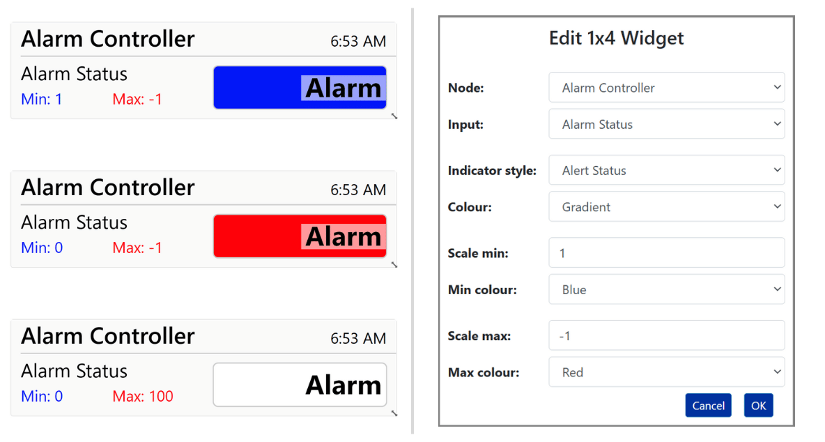
4x1 Widget - Alert Gradient
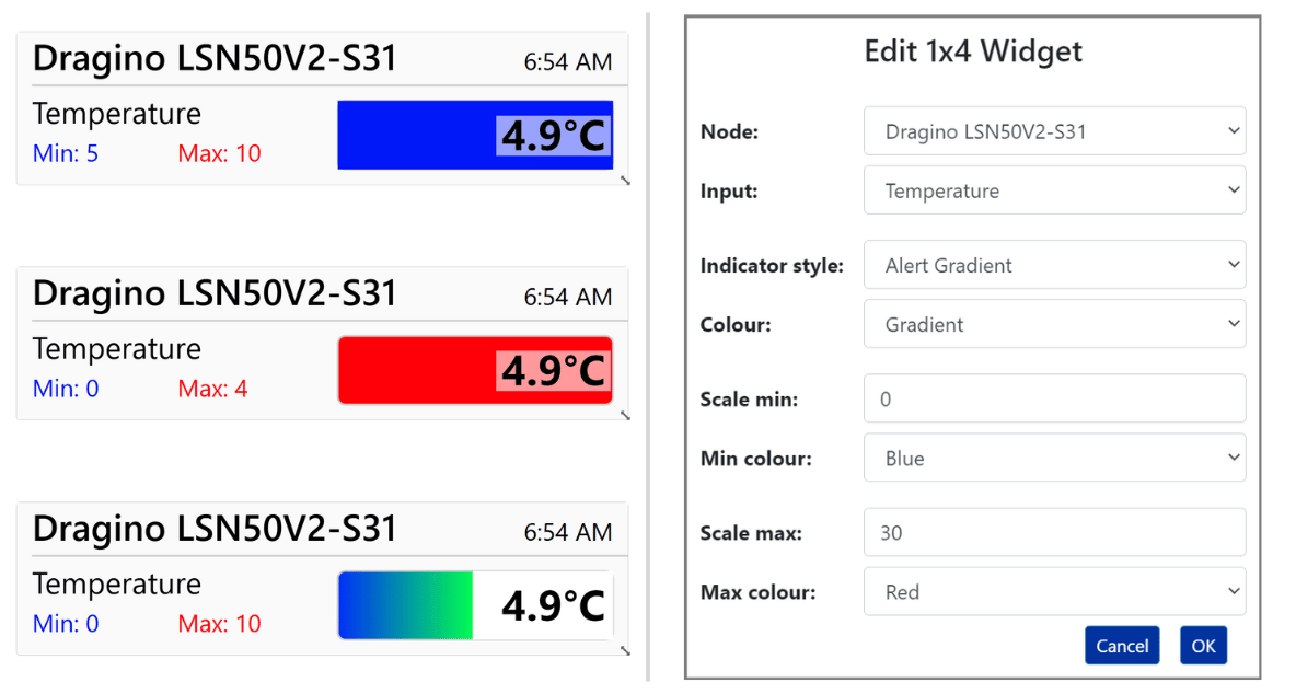
This low-profile widget is suitable for compact desktop layouts and single-column mobile dashboards. The Alert Gradient style displays the current value on a coloured linear scale and changes the background when the configured minimum or maximum is crossed.
- Indicator Style: Select Alert Gradient.
- Colour: Choose the colour used for the linear scale.
- Scale min: Enter the lowest displayed value, or leave blank to use alert or audit limits automatically.
- Min colour: Choose the background colour used when the minimum is crossed.
- Scale max: Enter the highest displayed value, or leave blank to use alert or audit limits automatically.
- Max colour: Choose the background colour used when the maximum is crossed.
4x1 Widget - Alert Status
The Alert Status style shows the current value on a white background until it crosses the configured minimum or maximum. The background then changes to the corresponding minimum or maximum colour.
- Indicator Style: Select Alert Status.
- Colour: This setting applies only to the Alert Gradient style.
- Scale min: Enter the lowest displayed value, or leave blank to use alert or audit limits automatically.
- Min colour: Choose the background colour used when the minimum is crossed.
- Scale max: Enter the highest displayed value, or leave blank to use alert or audit limits automatically.
- Max colour: Choose the background colour used when the maximum is crossed.
2x1 Widget
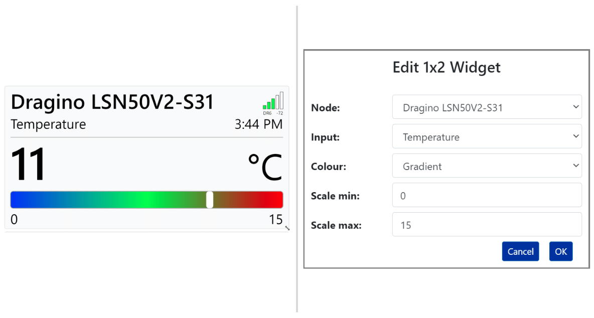
The 2x1 widget displays the current sensor value on a coloured linear scale. A white indicator shows the value's position between the configured limits.
- Colour: Choose the colour used for the scale.
- Scale min: Enter the lowest displayed value, or leave blank to use alert or audit limits automatically.
- Scale max: Enter the highest displayed value, or leave blank to use alert or audit limits automatically.
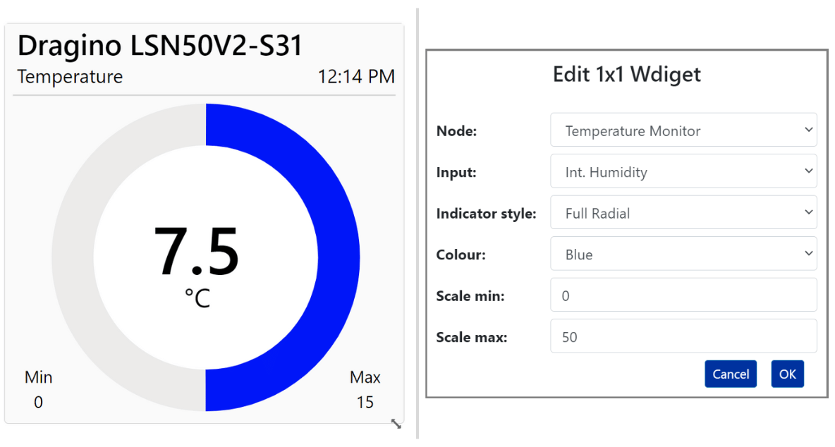
1x1 Widget - Full Radial
The Full Radial style displays the latest sensor value within a complete circular scale.
- Indicator Style: Select Full Radial.
- Colour: Choose the scale colour.
- Scale min: Set the lower scale value, or leave blank to use alert or audit limits.
- Scale max: Set the upper scale value, or leave blank to use alert or audit limits.
1x1 Widget - Half Radial
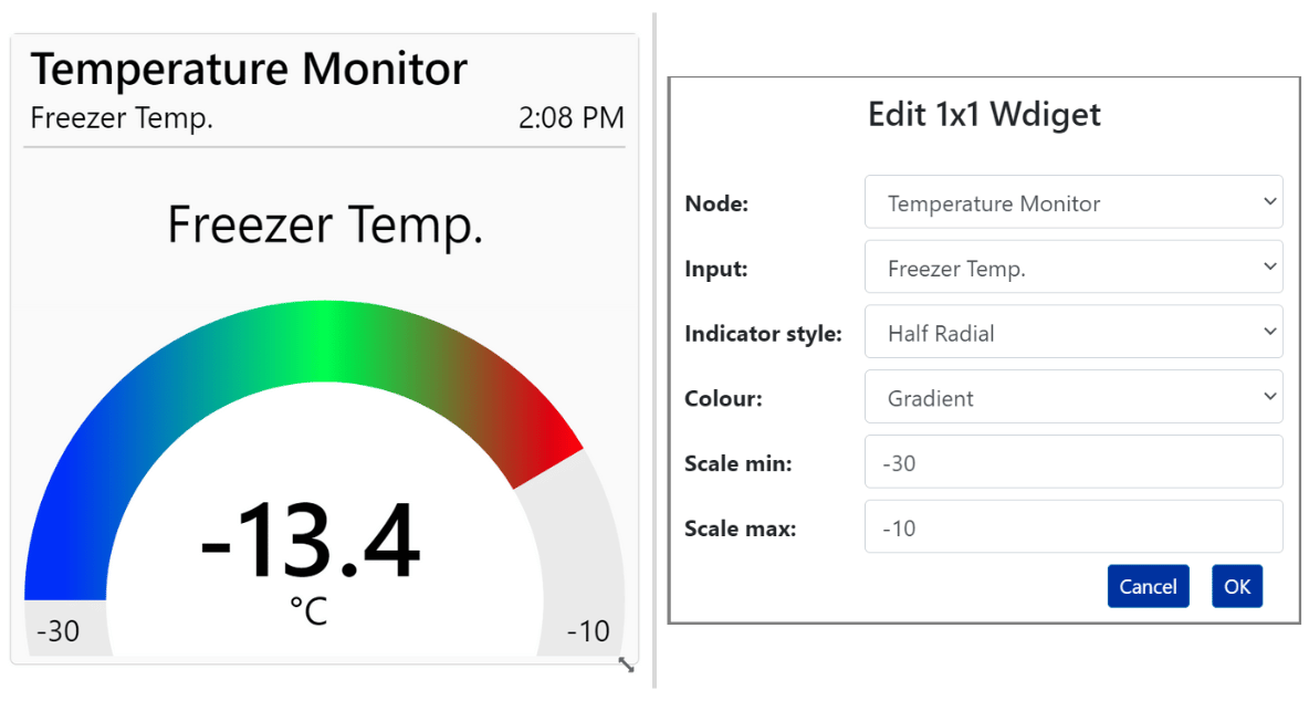
The Half Radial style displays the latest sensor value within a semicircular scale.
- Indicator Style: Select Half Radial.
- Colour: Choose the scale colour.
- Scale min: Set the lower scale value, or leave blank to use alert or audit limits.
- Scale max: Set the upper scale value, or leave blank to use alert or audit limits.
1x1 Widget - Dial Gauge
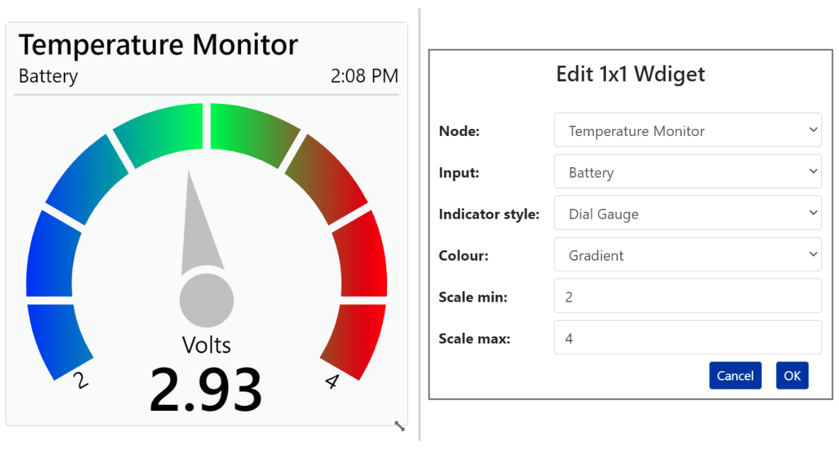
The 1x1 Dial Gauge style displays the latest sensor value on a circular gauge with a needle.
- Indicator Style: Select Dial Gauge.
- Colour: Choose the scale colour.
- Scale min: Set the lower scale value, or leave blank to use alert or audit limits.
- Scale max: Set the upper scale value, or leave blank to use alert or audit limits.
1x1 Widget - Fill Level
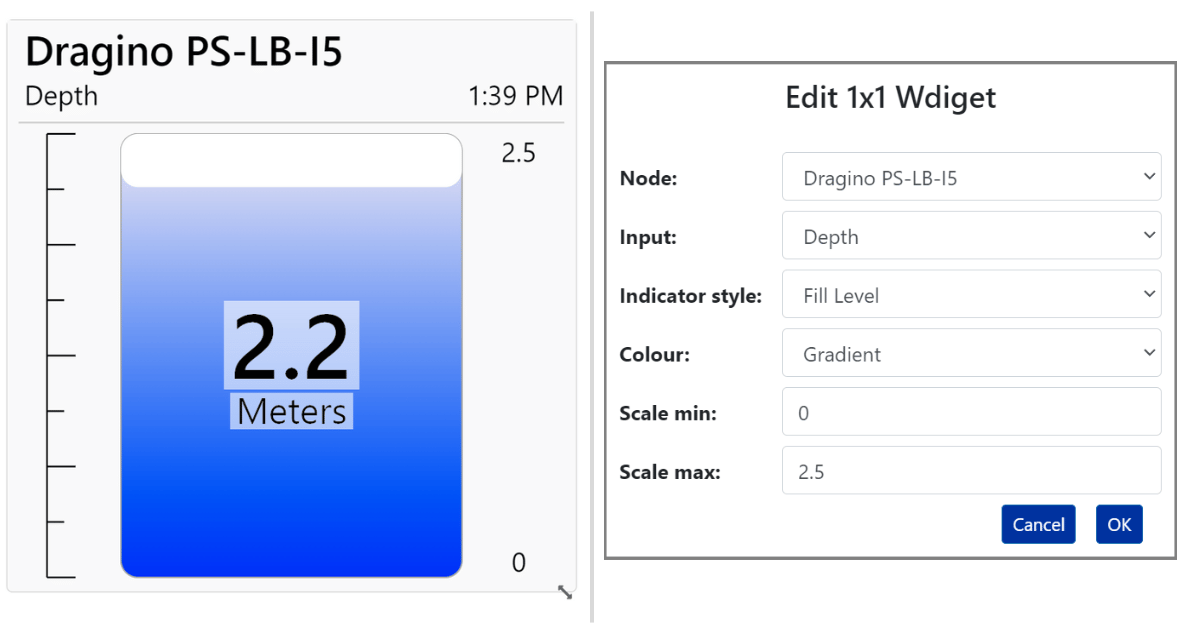
The Fill Level style displays the latest sensor value as the level within a tank-shaped scale.
- Indicator Style: Select Fill Level.
- Colour: Choose the fill colour.
- Scale min: Set the lower scale value, or leave blank to use alert or audit limits.
- Scale max: Set the upper scale value, or leave blank to use alert or audit limits.
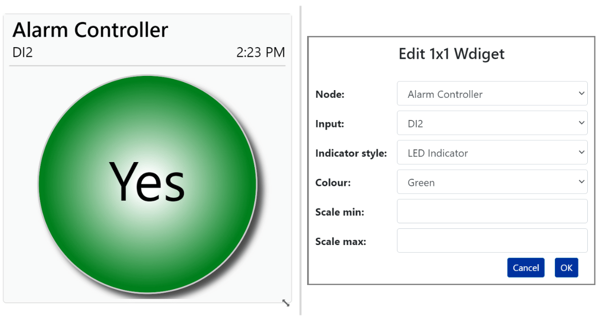
1x1 Widget - LED Indicator
This style provides a simple two-state indicator. A value of zero displays the LED as off with a white background. A value of one or higher displays the LED as on using the selected colour. The centre text shows the sensor value unless a translator is assigned to the input.
- Indicator Style: Select LED Indicator.
- Colour: Choose the active LED colour.
- Scale min: This setting has no effect.
- Scale max: This setting has no effect.
Dial Gauge
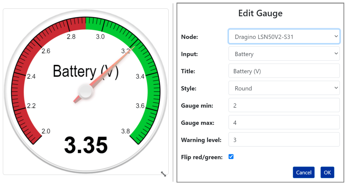
A configurable gauge with a needle indicator and the following settings:
- Title: Enter the text displayed below the needle.
- Style: Choose round, semicircle, or quadrant.
- Gauge Min: Set the lowest value displayed on the gauge.
- Gauge Max: Set the highest value displayed on the gauge.
- Warning Level: Set the value at which the gauge changes between green and red.
- Flip Red/Green: Reverse the default red-to-green colour direction.
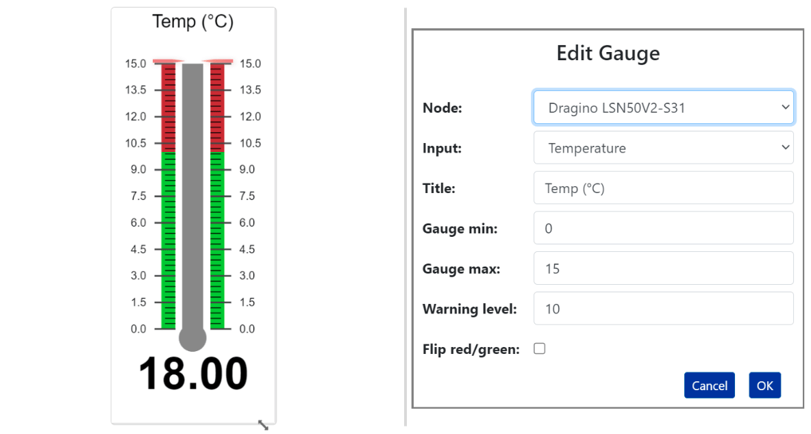
Temperature Gauge
The Temperature Gauge resembles a mercury thermometer but can also display humidity, soil moisture, and other compatible measurements.
- Title: Enter the text displayed above the thermometer.
- Gauge Min: Set the lowest displayed value.
- Gauge Max: Set the highest displayed value.
- Warning Level: Set the value at which the gauge changes between green and red.
- Flip Red/Green: Reverse which side of the warning level is shown in green or red.
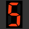
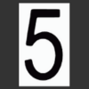
7-Segment Display
This widget displays the latest sensor value using a classic seven-segment display on a black background.
- Colour: Choose the display colour.

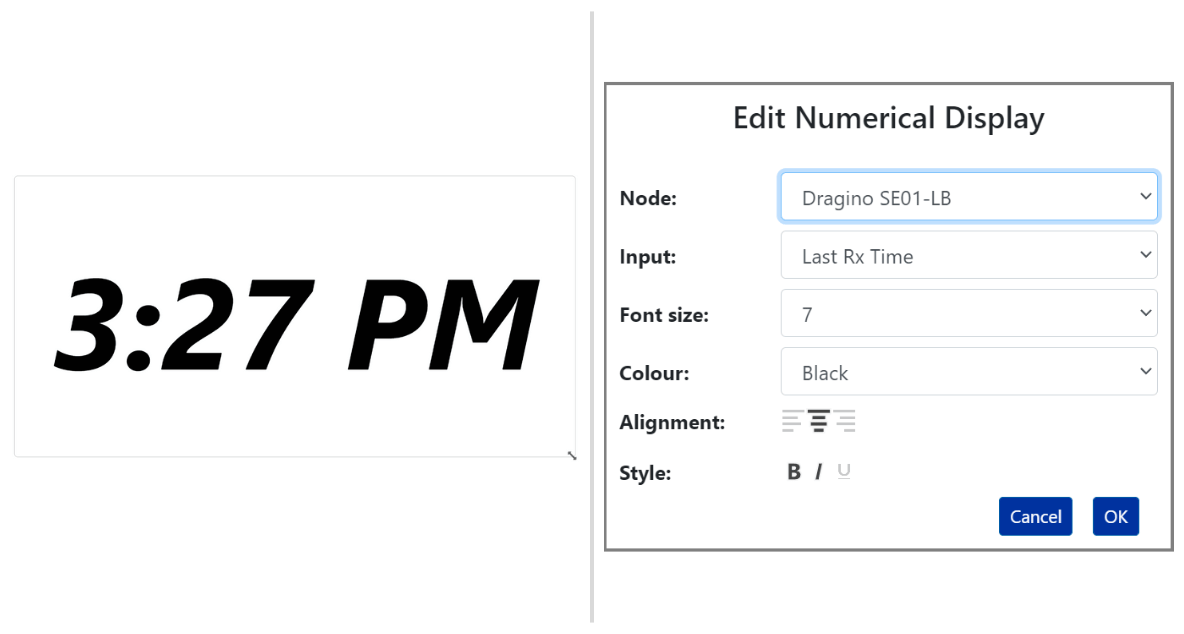
Basic Text Display
This widget displays the current sensor value as plain text with configurable size, colour, alignment, and styling.
- Font Size: Select a size from 1 to 7vw.
- Colour: Choose the text colour.
- Alignment: Align the text left, centre, or right.
- Style: Apply bold, italic, or underline formatting.
Text Widget
Place customised explanatory text anywhere on the dashboard canvas.
- Font Size: Select a size from 1 to 7vw.
- Colour: Choose the text colour.
- Horiz. Align: Align the text left, centre, or right.
- Vertical Align: Align the text top, centre, or bottom.
- Style: Apply bold, italic, or underline formatting.
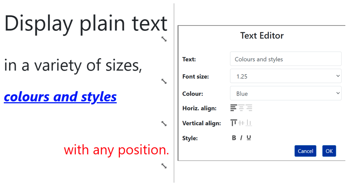
Chart Widget
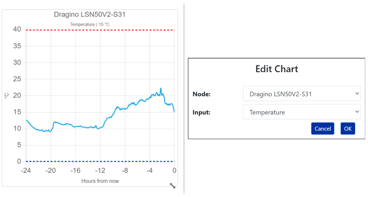
The Chart widget displays the selected sensor's previous 24 hours of data and adjusts its scale to the recorded values. When the sensor has alert conditions or audit limits, red and blue lines identify the configured upper and lower limits. Select only the required Node and Input.
LED Indicator
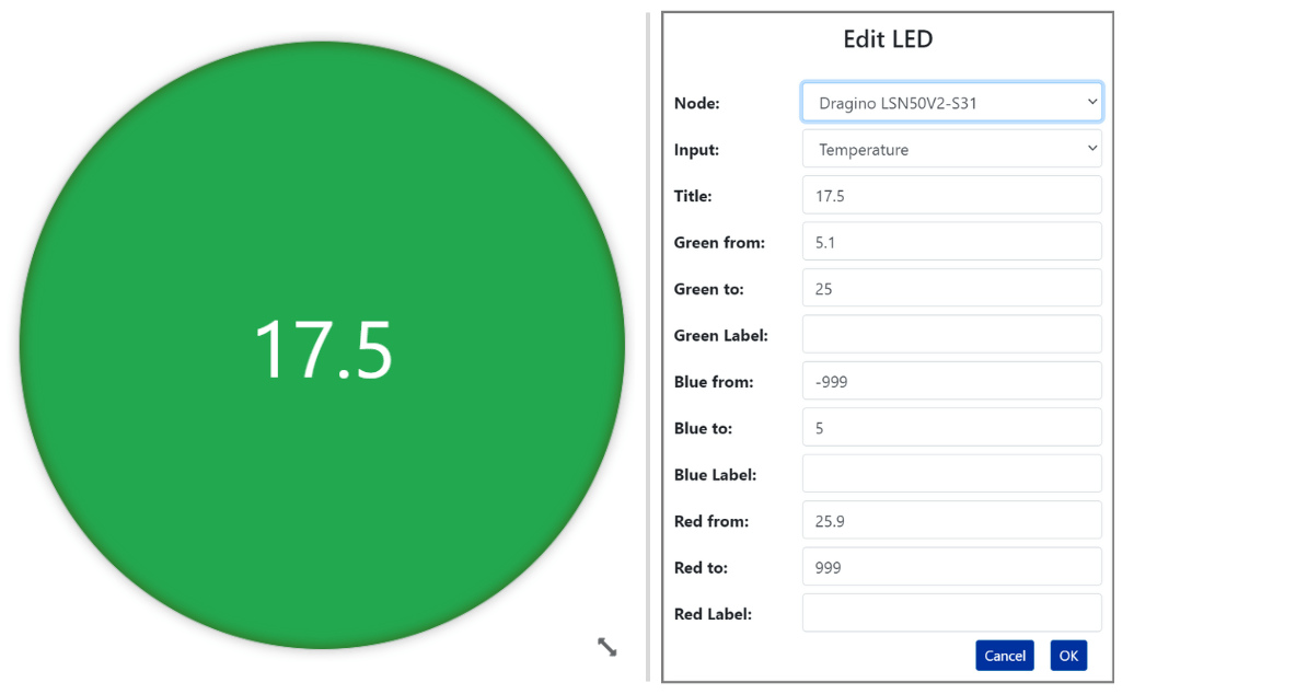
This configurable LED indicator displays red, blue, or green according to the latest sensor value and the ranges entered in its settings.
- Title: Displays the sensor's latest value in the centre of the widget.
- Green From / Green To: Define the green value range.
- Green Label: Enter the label displayed within the green range.
- Red From / Red To: Define the red value range.
- Red Label: Enter the label displayed within the red range.
- Blue From / Blue To: Define the blue value range.
- Blue Label: Enter the label displayed within the blue range.
Button
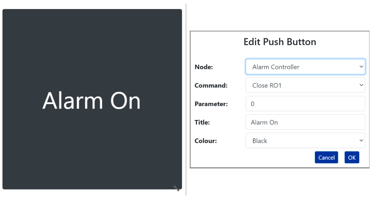
Link a supported control command to a dashboard button so the command can be sent without opening Node Maintenance. Available commands depend on the node and the device configuration assigned to it.
- Title: Enter the custom name displayed below the button.
- Colour: Choose red, green, white, blue, yellow, or cyan.
2.4 - Copying a Dashboard
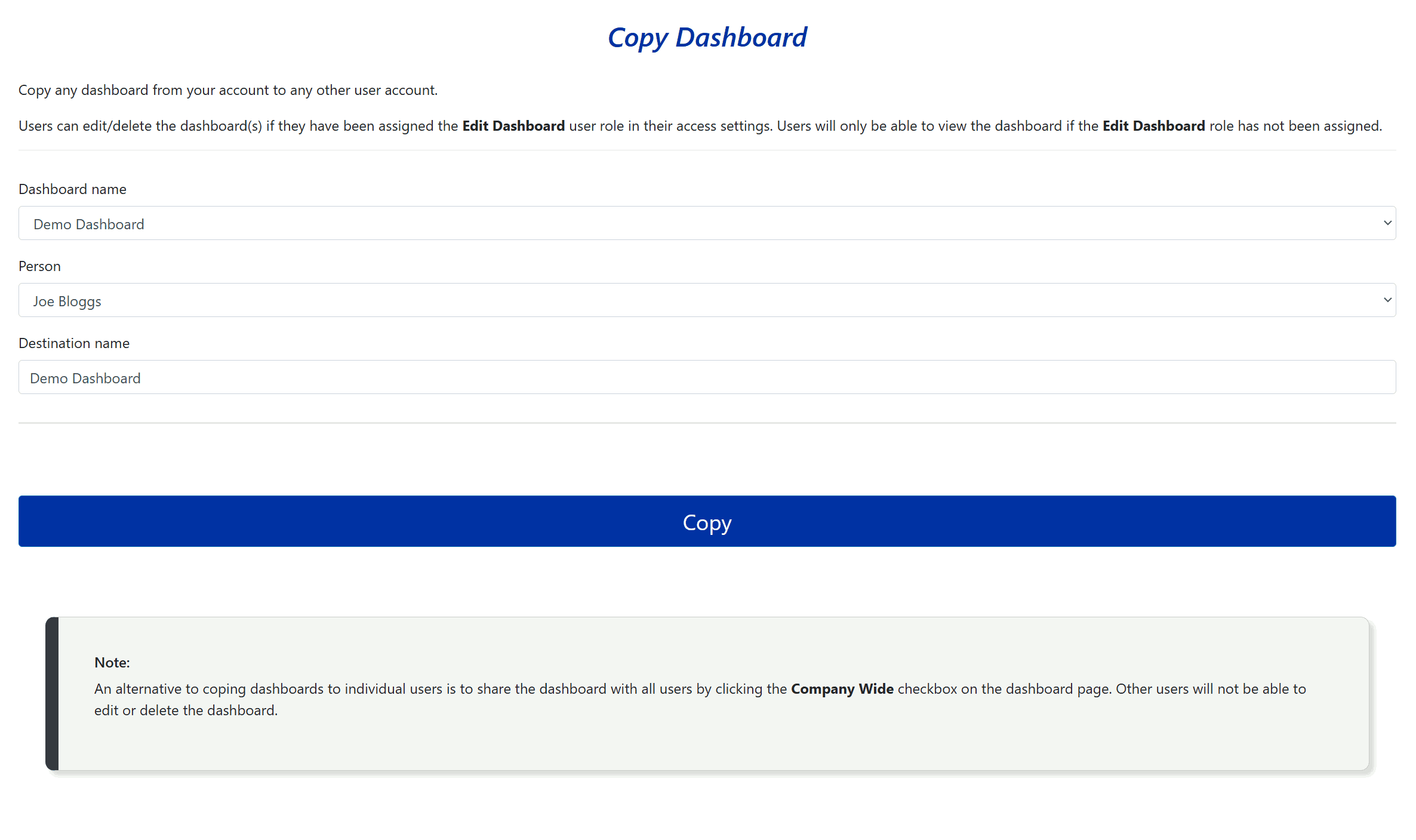
A user with the Company Admin role can copy an existing dashboard into another user's account.
This allows an administrator to prepare standard dashboards for users and control whether those users receive dashboard-editing permission. A recipient can edit the copied dashboard only when their user access includes the Edit Dashboard role.
- Select the source dashboard from Dashboard Name.
- Select the recipient from Person.
- Enter the copied dashboard's name in Destination name.
- Select Save.
The copied dashboard will be available in the recipient's account the next time they sign in.
2.5 - Sharing a Dashboard with All Users
Select Company Wide to make the current dashboard visible to every user under the same company account.
The checkbox appears beside the dashboard menu for users who can edit dashboards. Other users can view the shared dashboard but cannot change it, even when they have the Edit Dashboard role for their own dashboards.
If another user attempts to edit the shared dashboard, the platform identifies its creator and advises the user to contact that person. Clearing Company Wide or deleting the dashboard removes it from other users.