IoT Data Visualisation for Operational Insight
Analyse time-based sensor data through interactive charts designed for structured monitoring across connected wireless devices. Identify trends, view alert events in context, and navigate historical data ranges from any device.
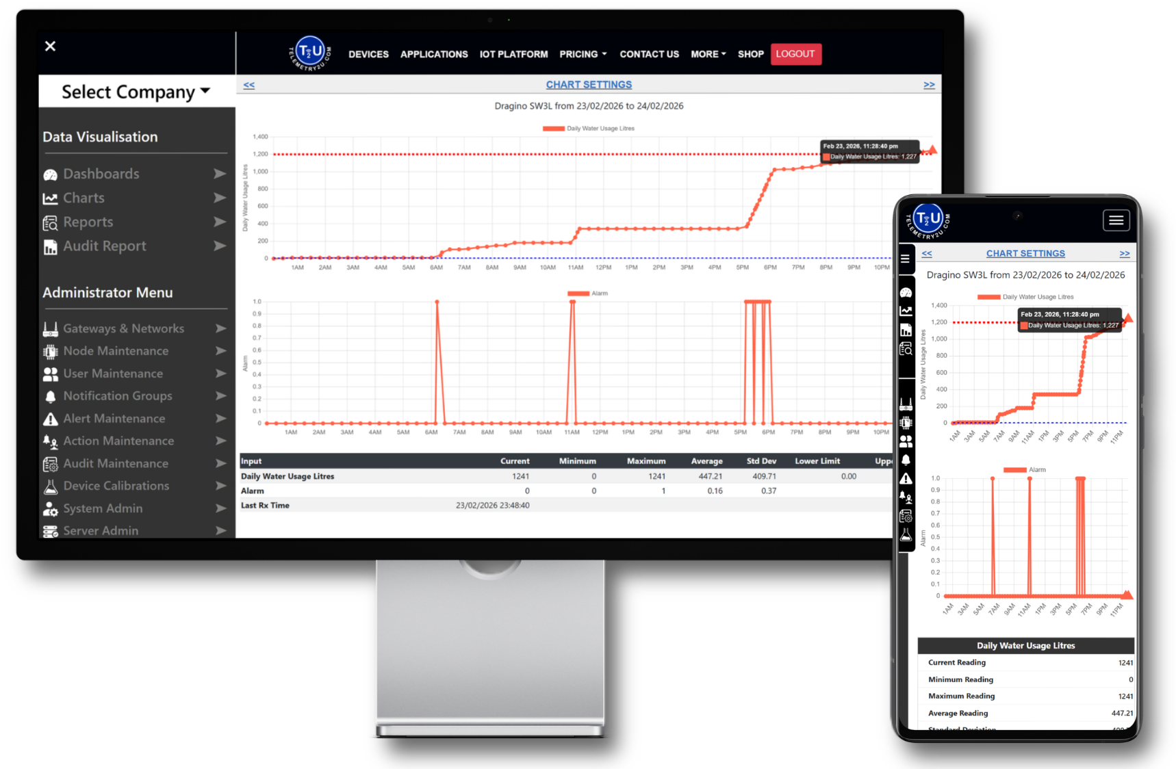
Interactive Time-Based Sensor Charts
Telemetry2U dashboards give you complete visibility across all connected devices. Monitor any connected wireless sensor, organise data your way, and respond instantly from anywhere with an internet connection.
Structured Monitoring Across Devices
Compare sensor behaviour across nodes, view multi-scale inputs on a single chart, and monitor alert activity across your entire account. Designed for structured oversight without adding complexity.
Cross-Node Comparison
Compare common sensor inputs across multiple nodes to evaluate performance, detect variation, and assess behaviour across locations within your account.
Multi-Axis Display
Display sensor readings with different units on separate scales within the same chart to maintain clarity while analysing related inputs.
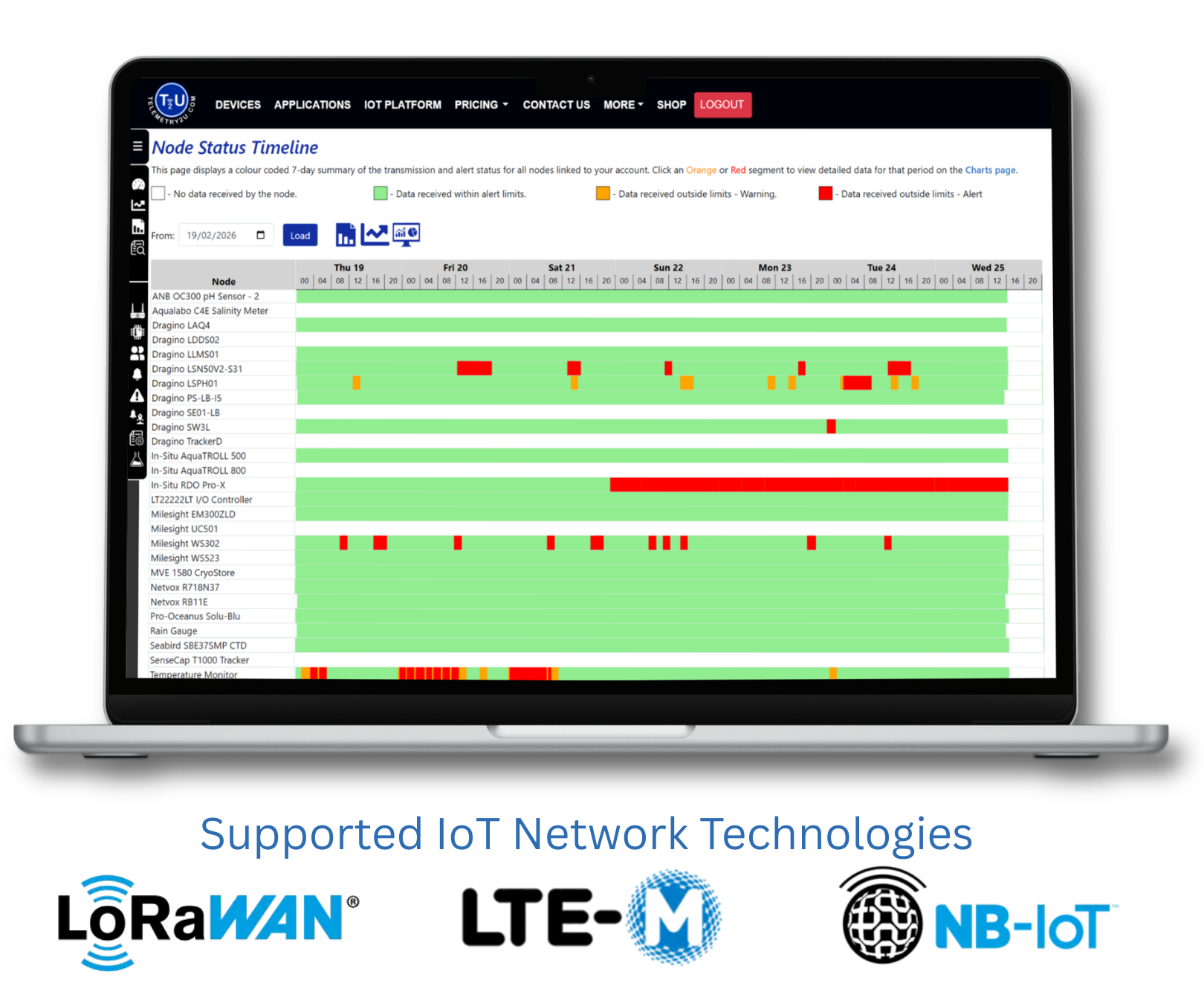
Alert & Status Timeline
View colour-coded alert and communication states across all nodes to quickly identify threshold breaches and connectivity interruptions over time.
Need Step-by-Step Setup Guidance?
Access structured documentation to configure chart views, navigate time ranges, and understand how alert thresholds and visual indicators are applied within the platform.